Why a cobalt blue glass?
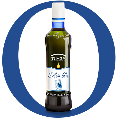
I never thought about designing a bottle. And I didn’t know anything about how a glass bottle is made! But when Tuscus turned 18 I thought he had to show he was an adult and give himself a new outfit, the one you wear in a festive day. So, almost absentmindedly, the mind chased shapes, imagined them as at a fashion show, or in the shop window of a jeweler. Dreams that brought me to make drawings on the blank sheet to look for that special shape and pencils that filled it with colors. Too high, too round, too mundane, too ... too much ... until the hand, free from all memory, has gone sinuous on the sheet. But the path was not finished yet. The color was missing. Designing means fishing in memory, shuffling the cards, relying on emotions.
Looking through the lens of my Canon, I was enchanted by the blue framing of the Uluṟu, the majestic sandstone mountain of the Australian outback known as Ayers Rock. It reminded me of the color of certain porcelain from our family collection that my mom used to call blue porcelain, that deep but bright blue that someone call “robin’s egg” blue, or the so-called “Wien blue” that can be spotted inside the Majorelle Garden, the house of Yves Saint-Laurent and Bergé in Marrakech, Morocco.
Or the blue of the sea of Ventotene, when the sun penetrates directly into it and returns its glare.
Or grandma Emma’s eyes, in which I used to get lost: it seemed as if a paintbrush dipped in different colours had drawn a kaleidoscope with that mysterious and magnificent blue in the middle.
I had found my Oli’n Blu!
But there was still something missing but I didn’t know what. Then one day browsing in a book about Tuscia and Etruscans I was struck by one detail: the musicians-dancers painted on the walls in the Leopardi's grave in the Necropolis of Tarquinia had an anklet ... I had found what would have make it special! A shining ankle, protruding just enough to collect the light.
It’s the same light that during the panel-testing every week, I see in the glasses where oil shines, that blue for which the COI (International Olive Council) felt the need of a regulation (COI / T.20 / Doc. 5 of 18 June 1987) which defines "the characteristics of the glass used for the organoleptic analysis of oils".
That cobalt blue pigment chemically stable, unalterable and responsive to the UV protection requirements that skilled hands have dosed to make my bottle go to the annealing furnace to ensure greater resistance. And then it is subjected to the check of dimension, shape, thickness, integrity, resistance not only for aesthetic and functional needs, but above all to keep unchanged over time the quality and characteristics of the oil that it must contain.
The blendmaster Arch. Fabrizia Cusani